Well, hello there, my fabulous people! In today's class, we were asked to consider what fonts and graphics we would use in our film opener. This may seem like a small detail, but in the big picture, the right font can completely transform the mood and emotional impact of a scene. Since our film opener is all about grief, loss, and the fracturing of friendship, we need fonts that feel creative and reflective.
The first font I chose is Lacquer. This font has a calligraphic and artistic feel to it. In other words, this font looks hand-painted in a way, almost as if someone were journaling in their diary. For our movie opener, this font could work beautifully for the opening credits because it has this expressive, emotional quality to it that matches the weight of our storyline. Moreover, the thickness of the letters gives it attention in a way that is subtle and not too harsh or aggressive. It is bold but still carries 'vulnerability,' which is similar to the balance we are trying to convey in our opener.

The second font I chose is called Shadows Into Light. This font is similar to Lacquer except it has a more casual feel to it. Both of these fonts have a handwritten style as the goal my group is trying to achieve is personal and authentic to the viewers. This font looks like something someone would scribble in the middle of the night when they simply want to express their emotions in perhaps a diary. I chose this font because it has a natural feel to it, as the letters are slightly uneven and have a pencil-like thickness to it. This font would be ideal for moments that show vulnerability, like if we wanted to show the captions on Polaroid memories. Thus, the handwritten style of this font adds warmth even within the sadness of the storyline in our movie opener.
The third font I chose is called Licorice. Licorice is a cursive script font that has a flowy, elegant quality. The letters connect smoothly, like a pen gliding on paper. The cursive strokes of this font give it a sense of emotion. Thus, this font would work beautifully for any poetic text or meaningful quotes that might appear throughout our film opener. If not for that purpose, this font could also be perfect for the opening title itself, because it has a cinematic quality to it that sets a reflective tone.
The fourth font I chose is called Bodoni Moda SC. This font is a small caps serif font with high contrast between thick and thin strokes. It has a classic and seamless quality that feels sophisticated, as if it were something you'd see in a high-end magazine. I think this font would be suitable for when we give a brief introduction of the characters. This font is more formal compared to the other three fonts, which helps mirror the similar contrasts we're exploring in our movie opener, such as appearance versus reality.

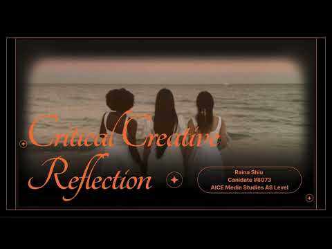
Now that I have discussed the fonts we plan to use in our movie opener, we also have options for the graphics we will use. So, for our fifth element or graphic that we plan to use is a subtle, grainy texture (possibly a specific font) to give the film a reminiscent vibe. The grainy texture would make it seem as if the moments in the film were footage from an old digital camera. This adds a layer of nostalgia and makes the scenes feel more like memories being replayed rather than events happening in real time. It is almost like we are looking back at these moments through a lens of grief and remembrance. Likewise, the grainy texture will also soften the image slightly, which helps create a dreamlike quality that my group is going for. For example, the font below is known as Margarine. As shown, this font has a subtle graininess to it, just like sand. The font is not too grainy but still has somewhat of a fuzziness to it. This font may be used in our movie opener during the beach scene as an overlay to show the inner thoughts of each character.
Lastly, another graphic idea that we plan to do in our movie opener is that since we selected multiple fonts, we will use some of those fonts as text overlays, like I mentioned before. In other words, throughout the movie opener snippets of text will appear as an overlay as if they were thoughts or memories of the characters. These could be brief phrases like "What will I do without you?" or "I need to stay strong." These phrases will help give insight into the characters' internal struggles without needing dialogue.


No comments:
Post a Comment